
The simplest way to combine colours for outfits is to anchor a neutral base with one confident accent, or to lean on a handful of pairings that never fail: navy and cream, camel and sky blue, terracotta and white. Stylists rely on these combinations season after season, and the same logic underpins the colour theory that fashion editors reference again and again. What follows is a working list, with outfit examples you can put together this week.
TL;DR:
- Navy and cream remain a versatile pairing that suits most skin tones and works well in both casual and formal settings.
- Camel and sky blue create a current, understated look, especially in knitwear paired with tailored trousers, ideal for transitional seasons.
- The 3-colour rule simplifies outfit coordination by combining one neutral, one dominant colour, and one accent, while the 3-3-3 rule enhances capsule wardrobe versatility.
- Bold colours should be limited to one statement piece, with neutrals forming at least 70 percent of the outfit to avoid overwhelming the look.
- Earth tones like chocolate and moss green continue to trend for warmth and grounding, especially when paired with brighter accents in the same palette.
Table of Contents
- Top colour combinations that always work
- How to apply colour theory: skin tone, placement and the 3-colour rule
- Build a small, mixable palette: capsule approach and seasonal tweaks
- Using neutrals and a capsule palette to mix and match
- Tips for incorporating prints and patterns with colour combinations
- How to balance bold colours with neutrals to avoid overwhelming an outfit
- Guidance on choosing colour combinations for different occasions
- Advice on using colour combinations to highlight personal style or create mood
- Colour experimentation on your own terms
- Shop the palette: Edito product picks to start with
- Sources
- FAQ
Top colour combinations that always work
Certain pairings earn their place in a wardrobe because they flatter almost every skin tone and translate easily from day to evening. Each of the following works as a starting formula rather than a rigid rule, and each can be adjusted with a scarf, a bag or a simple change of shoe.
- Navy and cream. This is the quiet achiever of colour pairing: navy anchors an outfit while cream softens it, and the contrast reads as polished rather than severe. The Elorina Dress in Navy does this well on its own, or pairs with a cream blazer for the office.
- Camel and sky blue. Warm camel against a cool sky blue creates a pairing that feels current without shouting for attention, particularly in knitwear paired with tailored trousers.
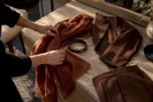
- Terracotta and white. A pairing that suits warmer months especially, terracotta brings warmth to a linen shirt or midi skirt, while white keeps the overall look light.
- Dusty rose and tomato red. Two shades from the same warm family, worn together, create a tonal statement that reads as considered rather than clashing. The Muriel Dress in Rose suits this pairing when styled with a red-toned bag or sandal.
- Chocolate and chartreuse. An earthy, deep brown grounds a sharper green accent, a combination that has moved from runway to everyday wardrobes.
- Black and hot pink. Classic black gains energy from a single hot pink piece, whether that is a top, a clutch or a pair of heels.
- Beige and blue. Soft beige and mid-toned blue sit together comfortably across dresses, separates and outerwear. The Reflection Dress in Beige/Blue is built entirely around this idea.
- Stone and moss green. A neutral trouser like the Palerme Pants in Stone pairs naturally with moss or olive tops, echoing the earthy palettes seen across current European collections.
- Ocean blue and warm neutrals. A piece such as the Talitha Top in Ocean works against camel, stone or cream trousers, letting one strong colour do the talking.
- Green tones on green tones. The Kai Pant in Moss paired with a lighter sage or khaki top gives a tonal look that avoids the flatness of matching too exactly.
- Keep fabric weight consistent within a pairing (a heavy wool trouser with a fine silk top can undercut an otherwise good colour match).
- When in doubt, let one colour dominate most of the outfit while the second colour plays a smaller, supporting role.
How to apply colour theory: skin tone, placement and the 3-colour rule
A little colour theory removes the guesswork. Complementary colours sit opposite each other on the wheel, such as blue and orange. Analogous colours sit side by side, like teal and green. Monochrome uses different shades of a single colour, and triadic schemes use three evenly spaced colours, such as red, yellow and blue, worn in careful proportion. These terms, drawn from established colour theory, give a vocabulary for decisions that otherwise feel intuitive.
Colours near the face matter more than any other part of an outfit, since they sit closest to the skin and can either brighten or dull the complexion. A scarf, top or even a swap in earring colour can lift a look far more effectively than changing an entire outfit.
- Test a new colour against your face in natural daylight rather than under artificial light.
- Photograph yourself on your phone: cameras often reveal what a mirror flatters over.
- If a colour looks muddy in daylight, move it away from the face and use it lower in the outfit instead.
The 3-colour rule simply caps most outfits at three colours: one neutral base, one dominant colour and one accent. A related packing method, the 3-3-3 approach, works with three tops, three bottoms and three accent pieces sharing a common palette, so every combination works without a second thought.
Pro Tip: Always check a new pairing in natural daylight before committing to it for a full day out, since indoor lighting can flatten or distort colour.
Build a small, mixable palette: capsule approach and seasonal tweaks
A workable palette starts with three decisions rather than an overwhelming wardrobe overhaul.
- Choose one neutral base. Stone, navy, cream or black all work; this becomes the backbone of most outfits.
- Choose two accent colours. Pick tones that complement each other and the base, such as terracotta and sky blue.
- Add one printed or textured piece. This introduces movement without adding a fourth competing colour.
Warmer months call for lighter tones and breathable fabrics: linen in particular is recommended for hot weather, since neutral or black linen offers a polished look while staying breathable, whereas white can be surprisingly difficult to wear in extreme heat. Cooler months allow for richer textures, deeper hues and heavier knits built from the same base palette. A capsule wardrobe built this way tends to reduce decision fatigue considerably, since a neutral base anchored by one or two accent colours keeps every piece talking to every other piece.
Using neutrals and a capsule palette to mix and match
Neutrals do the quiet work of a wardrobe. Stone, cream, navy and black rarely clash with each other, which means a handful of well-chosen neutral pieces can be worn in dozens of combinations without ever feeling repetitive.
A capsule palette applies this logic deliberately: pick one or two neutrals as your foundation, then let a small number of accent colours recur across your tops, trousers and accessories. A travel-ready capsule wardrobe makes this most obvious, since packing light forces every piece to earn its place through versatility rather than novelty.
The Palerme Pants in Stone illustrate the principle well: worn with a cream knit, they read as understated; worn with the Talitha Top in Ocean, the same trouser becomes part of a considered blue-and-neutral pairing. Neither outfit requires new trousers, only a shift in what sits above them. Accessories extend this further, since a bag or scarf in an accent colour can update a neutral outfit without adding another garment to the wardrobe at all.
Tips for incorporating prints and patterns with colour combinations
Prints are easiest to wear when treated as a colour statement in their own right rather than an extra layer on top of one. Identify the two or three dominant colours in a print, then build the rest of the outfit from those tones alone. A patterned piece worn with a single neutral, such as the Provencia Pants, keeps a look grounded while the print supplies all the visual interest.
Scale matters as much as colour. A bold, large-scale print reads best against solid, simple pieces, while a smaller, busier print can sit more comfortably next to another gentle pattern in the same colour family. Mixing two prints outright is possible, but it works best when their colour palettes overlap closely.
For those easing into pattern, a fail-safe formula suits time-poor mornings particularly well: a patterned bottom with a neutral top removes the guesswork while still allowing the print to carry the outfit. The same logic works in reverse, with a printed top worn over plain trousers in one of the print’s own colours.
How to balance bold colours with neutrals to avoid overwhelming an outfit
Bold colour works best in one place at a time. A single vivid piece, whether that is a hot pink top or a deep terracotta skirt, holds more impact when everything else in the outfit stays quiet. Two or three loud colours competing for attention tend to cancel each other out rather than amplify the look.
The simplest ratio to remember is roughly 70/30: let neutrals make up the majority of the outfit, with the bold colour doing the remaining work. A block of colour in a top or dress, paired with stone or navy trousers, keeps the eye moving to one clear focal point rather than scattering across the whole silhouette.
Texture can soften a bold colour further. A brightly coloured piece in a matte or soft fabric tends to feel calmer than the same colour in something glossy or stiff, which is worth considering when a strong hue feels slightly too much on first try. Accessories offer the lowest-risk entry point of all, since a bold bag or shoe against an otherwise neutral outfit delivers the same impact with far less commitment.

Guidance on choosing colour combinations for different occasions
Casual outfits give the most room to experiment, since a relaxed setting forgives a bolder pairing that might feel too loud at work. Terracotta and white, or dusty rose and tomato red, both suit weekend wear, particularly in easy fabrics like linen or cotton.
Workwear tends to reward restraint. Navy and cream, or stone and a muted blue, read as considered rather than distracting across long meetings and full days, and a single accent colour, introduced through a top or accessory, is usually enough to keep the look from feeling flat.

Formal occasions suit a monochrome approach or a controlled two-colour palette, since evening lighting and photography both flatter simplicity over complexity. A navy or black base with one metallic or jewel-toned accent, whether in fabric or accessory, tends to photograph and wear better than three competing colours fighting for the same attention.
Advice on using colour combinations to highlight personal style or create mood
Colour choices say something about mood as much as taste. Brighter combinations, worn with intention, are sometimes described as dopamine dressing, the idea that colour can lift mood, although the effect depends heavily on individual comfort and how well a colour suits an individual’s own skin tone rather than being universal.
Someone drawn to muted, tonal palettes, like chocolate and moss, tends to project a calmer, more grounded presence, while someone reaching for hot pink against black is signalling something more assertive. Neither approach is more correct than the other. The most effective use of colour matches the mood a person wants to project on a given day rather than chasing a trend that does not suit their own comfort with colour.
Colour experimentation on your own terms
Trends move quickly, but comfort with colour rarely does. Start small, an accessory, a single top, and let your own reaction guide the next step rather than what is trending this season.
— Mickael Martin
Shop the palette: Edito product picks to start with
Edito’s edit of European labels makes it straightforward to build these pairings without guesswork, since each piece is chosen for how it sits within a wider, mixable palette rather than as an isolated trend item.

- The Reflection Dress in Beige/Blue delivers the beige and blue pairing in one considered piece, ready to wear on its own.
- The Muriel Dress in Rose suits the dusty rose and tomato red combination when styled with a warm-toned accessory.
- The Elorina Dress in Navy works as a navy anchor for cream, hot pink or metallic accents alike.
- The Palerme Pants in Stone and Kai Pant in Moss both anchor earthy, capsule-friendly palettes.
- Browse the full Dresses collection for further colour-led pieces to build around.
Sources
- 6 Vogue editors’ tips for dressing stylishly in hot weather | Vogue Australia
- How to get dressed using colour theory - Fashion Journal
FAQ
What are the best colour combinations for outfits?
Navy and cream, camel and sky blue, and terracotta and white are among the most dependable pairings, since each combines a neutral with a single accent tone. Dusty rose with tomato red and stone with moss green also work well for those wanting a warmer, earthier palette.
What is the 3-colour rule for outfits?
The 3-colour rule limits most outfits to one neutral base, one dominant colour and one accent, which keeps a look cohesive without feeling flat. It draws on the same colour theory principles used to plan complementary and analogous pairings.
What is the 3-3-3 rule for clothes?
The 3-3-3 rule is a packing and outfit-building method using three tops, three bottoms and three accent pieces, all sharing a common palette. It works particularly well for capsule wardrobes, since every piece is designed to mix with every other piece.
What colours are fashionable for 2026?
Earthy tones like chocolate and moss sit alongside brighter accents such as hot pink and tomato red in current collections, often paired with a calm neutral base. These pairings tend to work best as accents within an existing wardrobe rather than a full colour overhaul.